Design
TravelX · 2024
TravelX — Booking App UX Redesign
A mobile-first UX redesign of a travel booking app that increased booking completion rate from 12% to 34%.
12%→34%Booking Rate
8→3Checkout Steps
3.2→4.6App Rating

Example client: Clarity Analytics · Service: UI/UX Design
A complete UX overhaul of a B2B analytics dashboard that reduced onboarding time by 60% and increased daily active usage by 45%.
Modelled outcomes — the targets we would set and track for a project of this shape.
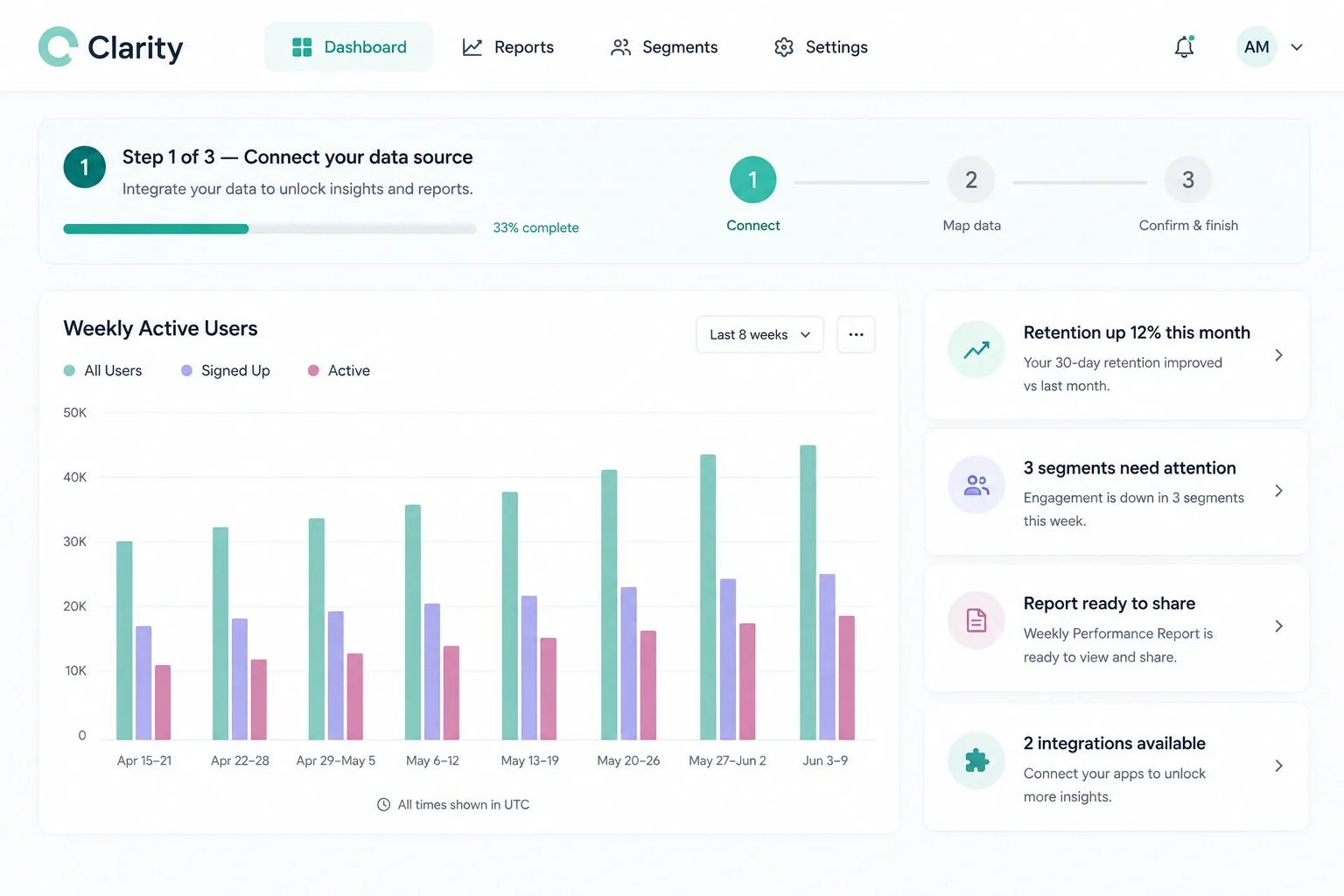
Clarity Analytics had a powerful data product but terrible UX. New users took an average of 45 minutes to complete onboarding, feature discovery was nearly zero for advanced tools, and their NPS score had dropped to 18.
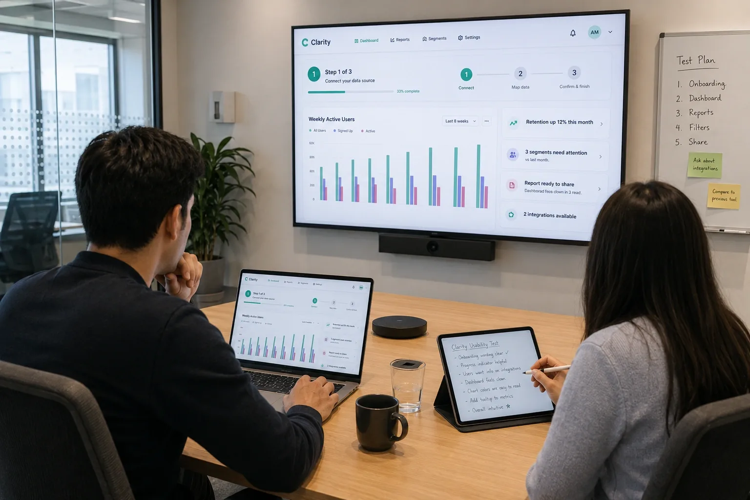
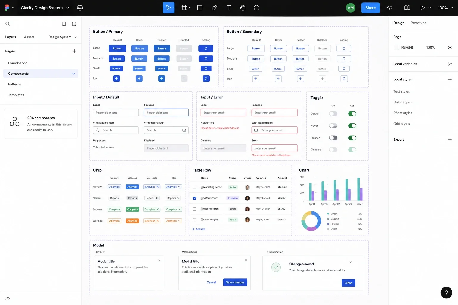
We ran user interviews with 20 customers, mapped pain points, and redesigned the entire dashboard experience. Key changes: simplified onboarding wizard (7 steps → 3), progressive disclosure for advanced features, redesigned data visualization components, and a contextual help system. We delivered a Figma component library with 200+ components.
Inside the Project
Get a detailed scope, budget & timeline for your project — powered by our AI Scope Analyzer.