Design
Clarity Analytics · 2025
Clarity — SaaS Dashboard Redesign
A complete UX overhaul of a B2B analytics dashboard that reduced onboarding time by 60% and increased daily active usage by 45%.
-60%Onboarding Time
+45%DAU
18→52NPS Score

Example client: TravelX · Service: UI/UX Design
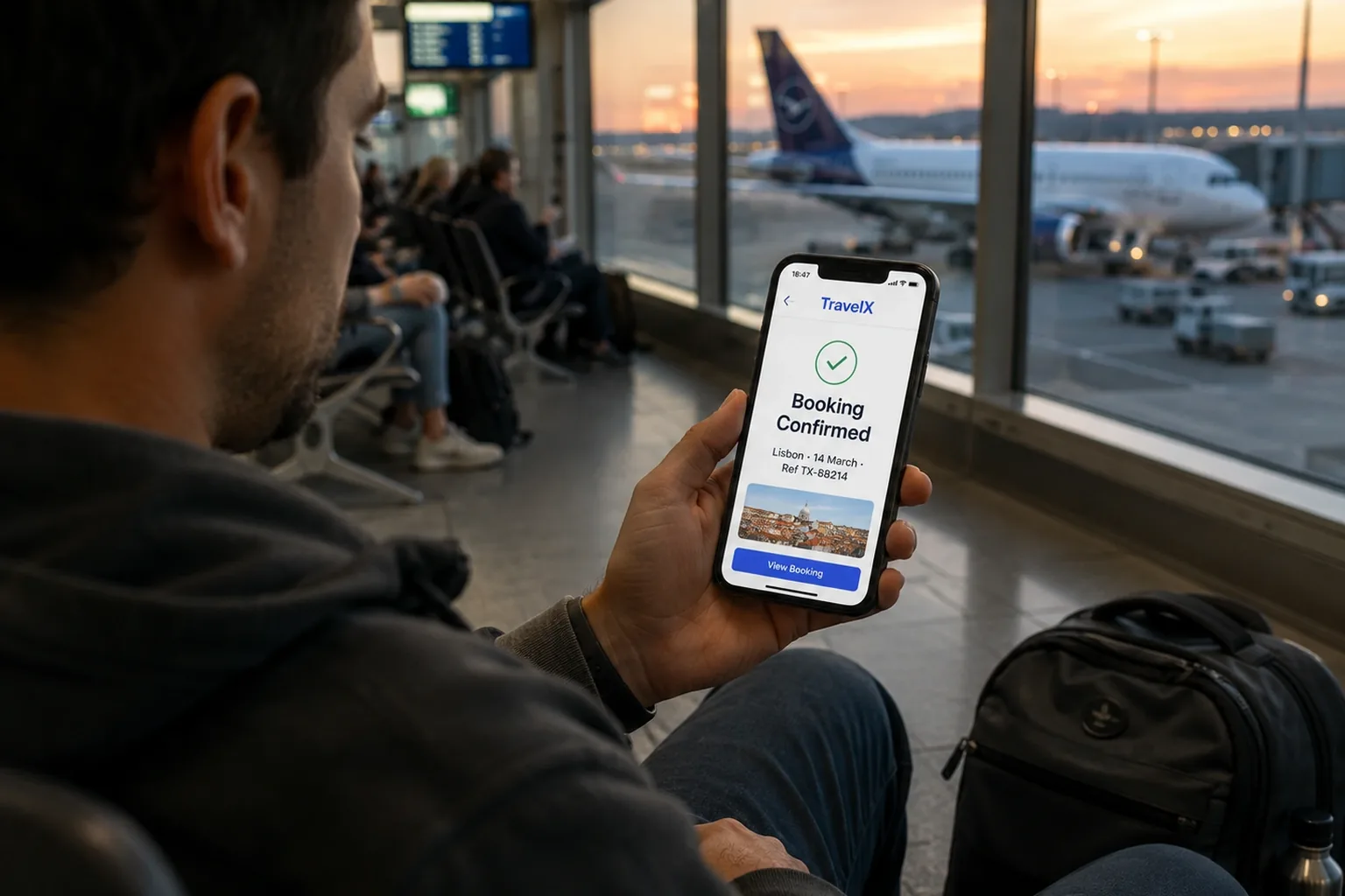
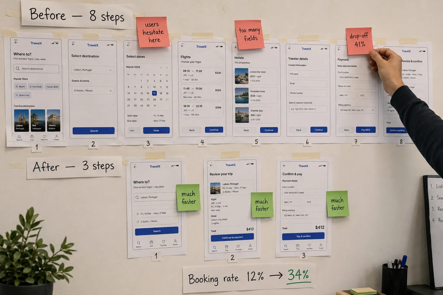
A mobile-first UX redesign of a travel booking app that increased booking completion rate from 12% to 34%.
Modelled outcomes — the targets we would set and track for a project of this shape.
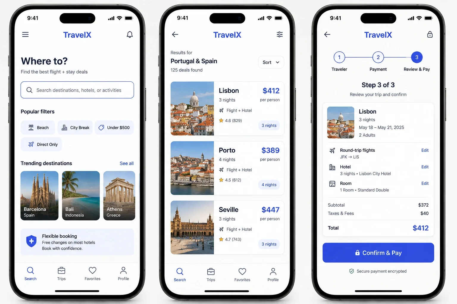
TravelX's booking app had a 12% completion rate — users were abandoning at the search results and payment steps. The UI felt dated, search filters were confusing, and the checkout flow required 8 taps to complete a booking.
We conducted usability testing, identified 14 friction points, and redesigned the core flows: search, results browsing, and checkout. We introduced smart filters, visual itinerary builders, and a streamlined 3-tap checkout. The new design system was built for both iOS and Android consistency.
Inside the Project
Get a detailed scope, budget & timeline for your project — powered by our AI Scope Analyzer.